Barry Ritholtz of The Big Picture says:
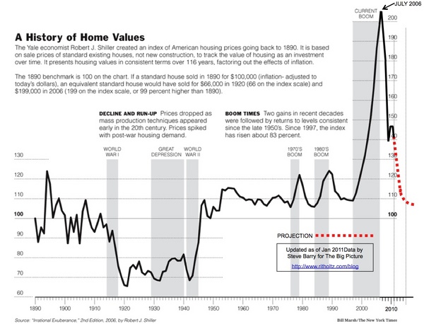
In 2006, just as the Housing market was peaking, the NYT ran this graphic of the 100-year Case Shiller chart. It showed how radically overvalued Housing had become.
Two years later, TBP reader Steve Barry updated that graphic, including the projected Home Price mean reversion.
Its time to update this for 2011. Note the 2009 tax credit wiggle.
Case Shiller 100 Year Chart (2011 Update)
View original post here:
Home value chart updated 1890-2011


