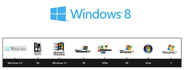
Microsoft is making plenty of big changes with its Windows 8 operating system, and that has now also extended to a new logo. As explained by Microsoft’s Sam Moreau in a post on the official Windows blog, the logo was created with the help of the design agency Pentagram, which posed a simple question when it began on the project: “your name is Windows. Why are you a flag?” That discussion eventually led to the four-paned window you see above, which not only looks more like a window than the previous logos, but clearly echoes the company’s new Metro design language. Microsoft also notes that the logo is “authentically digital,” and says it will welcome you with a slight tilt and change color based on your desktop. You can see a bigger version after the break, and read the full story of its creation (along with a look back at past logos) at the source link below.
Continue reading Microsoft reveals Windows 8’s new logo: ‘It’s a window… not a flag’
Microsoft reveals Windows 8’s new logo: ‘It’s a window… not a flag’ originally appeared on Engadget on Fri, 17 Feb 2012 12:42:00 EDT. Please see our terms for use of feeds.
Permalink |  The Windows Blog | Email this | Comments
See original article:
Microsoft reveals Windows 8’s new logo: ‘It’s a window… not a flag’


